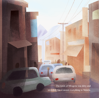
Started on the next page today! This one took me longer to do as I am not used to making 'busy' illustrations - but its good because I need the practice! For this page I was inspired by Jamey Christoph's illustrations in his children's book 'Gordon Parks'. I used his colour palette to start off with, but then it sort of changed as I went.
The image on the left was what I came up with, but I felt it was a bit dull and didn't match the boldness of the previous page - so I increased the saturation and adjusted the levels.
This is the photo I used as reference:
I've intentionally not made the town look too 'dirty and crowded'. The reason for this is because I want there to be a really big contrast later on in the story when she returns to Mingora and everything is in rubble. I also decided that the text needed a plain background to make it easier to read - I used white at first, but because this area is darker, I felt that white was too overpowering and distracting when trying to view the illustration. So I decided to use a less contrasting colour.
I also thought about changing the colour of the text itself. Personally, I like this better because you can view the whole image without there being any obstruction. But because the book is aimed at children, I have to consider whether this affects the legibility. I've asked two girls who are in year 9 and 5 and they said that they liked the text with the plain background better as it makes it easier to read. I'll ask some more people before I make a final decision though.


No comments:
Post a Comment