Thursday 31 December 2015

Additional Merchandise Research

I decided to do a bit of research on product ranges based on children's books as I also want to propose making additional products based on my book. The images below I think sum up the common products that are produced around children's books: mugs, bags, badges (school related things and homeware).

Book Development

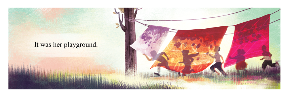
Double page spread below is the one I worked on today - my book is finally finished and ordered for printing! I've been informed that the estimated delivery time is 13th January or before, so one day before the deadline - a bit risky, but I have faith, hopefully it'll arrive on time. I wanted to print more than one copy of my book but I've decided to wait because I want to find some printing places in Leeds or Bristol first because they might turn out cheaper. 


I had to adjust some pages again, because there were some errors according to the blurb plug-in (just realised 32 pages doesn't include the covers with blurb so had to add a few more pages at the start and end to make 32) so the first couple of pages have changed slightly, but this doesn't affect the story really so its alright!


I've been posting sneak peeks of my book online, and I am so thrilled that people are actually showing interest in it! I really do want to continue with this project and develop more children's books like my Malala one after graduation and actually approach publishers or maybe collaborate with human appeal organisations (if thats even possible). I want to use my skills to help people and to try make a positive impact in the world (also to help me grow as a person by putting myself in people's shoes and understanding more about things) - I want to help raise awareness of issues happening around the world, encourage empathy to people early in life and increase prosocial behaviours. This is something I feel is really important and something I really care about! I might come across as unbelievably cheesy, but a better world is really what I want to strive for!


I'm really tempted to submit my book (or a couple of pages from it) to The World Illustration Awards 2016 for the Children's Book category! I'm going to ask what Fred or Teresa thinks!


holy guacamole, its so expensive to enter though.. 

Monday 28 December 2015

Book Development

At the moment this is what I have for the front cover. I've decided to go with 'The Girl Who Stood Up' instead of 'The Girl With A Voice' because this sounds like its a story about singing. The title i've decided to go with is quite similar to her autobiography, but maybe thats a good thing? I thought it also goes better with the quote I'm putting on the back cover: "... I want to be remembered as the girl who stood up". I also thought it would be a good idea to keep the cover quite simple to compliment the pages inside (loads of colours and illustrations). Though it's quite simple, I think it also looks rather bold with the title on a plain background - makes you curious to pick it up and flip though the pages to see what the book is about. But it might still change once I finish the book.. we'll see.

Friday 25 December 2015

Book Develpoment

I've started colouring in the characters. I feel like I enjoyed doing the backgrounds more than drawing the characters.. this is strange for me because I thought I was more of a character person before. But now I actually prefer drawing backgrounds (but I'm still into drawing people)! Maybe this has something to do with the plein air paintings/gouache practices I've done a few weeks back. Just shows how much trying out new things can be very eye opening!

I've decided to blur things in the foreground a bit because it looked a bit flat (and kind of distracting actually). It adds more depth to the composition this way. and also puts the focus not just on the character but on the bigger picture as the text describes.


Thursday 24 December 2015

Book Development

I wanted to see how this would look as a book spread so I mocked it up! I also posted this on my Instagram to see what people thought and comments were really positive and they can't wait to see the book finished! I'm excited as well to be honest! I can't believe how fast I'm working on it! I feel like should believe in myself more, because I can do it when I really put the effort in!

Wednesday 23 December 2015

Book Development

I've started drawing the characters in! So far it's just the sketch. I will colour them in once I've got all of the characters in each page sketched out - should be a breeze after that! I'm excited, can't wait!


I'm also going to be reusing drawings (if and whenever I can) like I did for the Charlie's Kidney Transplant book as this would make it more time efficient and hopefully will allow me to get the book done faster (but of course, if I had more time, I would diversify the facial expressions as much as possible to keep it from looking too repetitive - if I were to approach a publisher, I would amend some things first beforehand.)

Tuesday 22 December 2015

Book Development

I absolutely LOVE playing about with lighting! I've always wanted to improve my lighting skills and this project is allowing me to do that - This is one of the reasons why I'm enjoying this book project very much, because it challenges me to try out new stuff and improve on the skills I'm lacking, such as drawing backgrounds etc! I think I'm getting better. I feel like I have a better understanding of colour too and layout - relationship of the text and the illustration in a picture book.


This illustration will sit on the page like so:

Sunday 20 December 2015

Book Development

For this illustration I was inspired by EliOli and this picture:

I'm really pleased with how it's turned out! and I'm really enjoying myself! I feel like I'm going crazy with the colours but the comments I've received so far have been really positive, so I will keep doing what I'm doing. I did say I wanted to try working with a limited number of colours in this post (and other earlier posts too), but my brain just sees things in full colour and I just cannot help myself. I just hope that the colours would still look good when printed - I've never really been satisfied with my artwork once printed! I always keep a close eye on gamut warnings and things but they always end up not like how I want it. I'm very specific when it comes to my work - maybe I'm too specific?


This is how the illustration is going to sit on the page:

Just checked the blurb website again - there is a 20% discount til 5th Jan! I am determined to get this book finished before then so I can use it! yes!

Wednesday 16 December 2015

Book Development

I've asked more people about which text they prefer for the page below and the majority favoured the white text. So I've decided to go with this. I've made the ground slightly darker as well so this should make it easier to read.


These pages are supposed to have Malala in the picture but I'll do that after. I've decided that I'm going to do all the backgrounds first and then I'll draw the characters in after all the pages are done. Should be faster this way! I used Jamey Christoph's work again as inspiration hehehe! I'm a big fan can you tell?


oh boy oh boy oh boy! Jamey Christoph likes my work!

Saturday 5 December 2015

Book Development

Started on the next page today! This one took me longer to do as I am not used to making 'busy' illustrations - but its good because I need the practice! For this page I was inspired by Jamey Christoph's illustrations in his children's book 'Gordon Parks'. I used his colour palette to start off with, but then it sort of changed as I went.

The image on the left was what I came up with, but I felt it was a bit dull and didn't match the boldness of the previous page - so I increased the saturation and adjusted the levels.


This is the photo I used as reference:

I've intentionally not made the town look too 'dirty and crowded'. The reason for this is because I want there to be a really big contrast later on in the story when she returns to Mingora and everything is in rubble. I also decided that the text needed a plain background to make it easier to read - I used white at first, but because this area is darker, I felt that white was too overpowering and distracting when trying to view the illustration. So I decided to use a less contrasting colour.


I also thought about changing the colour of the text itself. Personally, I like this better because you can view the whole image without there being any obstruction. But because the book is aimed at children, I have to consider whether this affects the legibility. I've asked two girls who are in year 9 and 5 and they said that they liked the text with the plain background better as it makes it easier to read. I'll ask some more people before I make a final decision though.

Friday 4 December 2015

Book Development

 Started digitising things! I began with really simple shapes and then built it up. I also started with this green colour palette but I wasn't feeling it - It looked muddy instead of serene and calm like how I've been imagining it in my head. So I decided to change the colour and used blues and purples as the main colours, inspired by one of Junyi's work. I think this works much better and I really like how it has turned out! I'm having real fun playing with shapes, textures and lighting! I'm excited now!


I also made sure to crop/resize the image to the right dimensions for the blurb book custom printing - so I won't have to worry about it at the last minute. It took me 2.5 hours to complete this illustration, 1 hour of it was spent figuring out the colours and trying out textures and techniques - now that I know how I want my illustrations to look, I'll be able to paint faster - which is great news because I think I'll be able to finish it before January! which leaves enough time for me to get it printed professionally, and hopefully arrive in time too!


I recently purchased Griz and Norm's book and I've learnt from it that the value of your image is a really important thing. If your value reads, then your image will read, no matter how crazy your colours are. So I've also made sure that my value reads well before deciding that I'm finished with my illustration.


Slight change of plan with the map inside pages - the book that I've chosen from the blurb website doesn't have the option to print on the inside of the covers. So instead of having the double page spread of the map at the start, I will have half of it and at the back of the book I will have the other half. I don't think this is too much of a problem to be honest as its purpose is mostly to decorate. So I'm quite fine having it this way for now.