Saturday, 18 October 2014

Study Task- 1 Library Research Task

2 illustrative images, which I feel have a relationship with my selected quotes and which I feel are both meaningful and visually interesting. From Bruce Mau's An incomplete manifesto for growth, 1998..

"20. Be careful to take risks. Time is genetic. Today is the child of yesterday and the parent of tomorrow. The work you produce today will create your future."
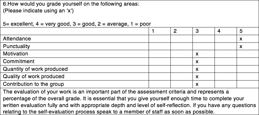
Risking for more - Yuko Shimizu, 2008
"33. Take field trips. The bandwidth of the world is greater than that of your TV set, or the Internet, or even a totally immersive, interactive, dynamically rendered, object-orientated, real-time, computer graphic-simulated environment."
Tourist - Valentin Tkach, 2010
Both of these quotes I also feel have a relationship with "1. Allow events to change you", "The prerequisites for growth: the openness to experience events and the willingness to be changed by them." and "12. Keep moving", "Allow failure and migration to be part of your practice."

Both illustrations found in Illustrations Unlimited: The Essence of Contemporary Illustration

Wednesday, 7 May 2014

OUIL 401 End of Module Evaluation

I think the main skill that I have developed through this module is my researching skill which I think the research is also the strength in my body of work. I have learnt how to find the appropriate sources for my essay and also how to Harvard reference. In studio brief 2, although I have tried to use the knowledge I’ve gained from my research to inform and develop my idea, I don’t think that my final outcome communicates the research very well; I am not quite sure if I have made it clear for the audience to understand what it is I am trying to communicate with my piece without being briefed on it first. This may or may not be a bad thing but I feel like I might have strayed just a bit from my chosen topic.

Using the sketchbook in studio brief 2 has allowed me to bring in more media play into my work, which is good as I have not really been experimental with other medias other than digital ones in the previous modules. However, I found filling out our sketchbooks at the beginning of the brief quite a struggle, as I am not used to just sketching without knowing what it is that I want to communicate first. I felt quite lost for this part of the brief - I am not sure if this is due to the subject that I decided to delve into or if I’ve just really lost momentum and not working as hard - but I think this has had a negative impact in my motivation and commitment to do other things later on in the process.

Things I would do differently if I were to do this again:
  1. For the second brief, to pick a less broad subject - so to not leave me with too many choices that would confuse me
  2. But if I were to do it on colour again, I think I would make the final outcome more informative, in a booklet format or a zine with a combination of text to add support and explanation of the subject as it is quite hard to explain with only pictures.
  3. Try and put as much effort into my work in this module as I have done for the others.

Friday, 2 May 2014

What kind of aesthetic do I want?

I love how these animations have very limited colours - I like how the colours are only used for the characters/subjects - the important bits. Because I am focusing on the colours and characters, I think this kind of look would be very effective for my piece.


The Best Toy from Gabriel Lin on Vimeo.

Float from McKenna Harris on Vimeo.

Refining drawings


A change in direction

In the feedback, my peers thought that the playing cards is a good way of showing contrast in the two different cultures. However, they also really liked the colour swapping and the bikers as it could be more engaging and playful. Adele suggested that maybe I could create a scene or scenes where the colours used were all 'wrong'. So I decided take a step back and try to do something with the bikers as people really liked it:


one of my earlier ideas was to make a comic about a character who gets transported into a parallel universe where the use of colour in products, road signs etc are not what he/she is used to. I decided to try make a comic about some biker dudes (above), but I couldn't get the composition to look right - never realised how hard comics are to make! Once my frustration kicked in, I decided to do some thumbnails of stand alone pieces instead, as I think I am better at this than I am with comics.


I also thought about maybe changing the font of the stop sign, like this:

I really liked my first thumbnail but I thought it needed something more make the story clearer. I decided to try adding a couple more panels to see how this would look:
 Then I decided to try changing the expression of the macho, manly, angry looking biker: