I think the main skill that I
have developed through this module is my researching skill which I think the research is also the strength in my body of work. I have learnt how to find the appropriate sources for my essay and also how to Harvard reference. In studio brief 2, although I have tried to use the knowledge I’ve gained from my research to inform and develop my idea, I don’t think
that my final outcome communicates the research very well; I am not quite sure
if I have made it clear for the audience to understand what it is I am trying to
communicate with my piece without being briefed on it first. This may or may not be a bad thing but I feel like I might have strayed just a bit from my chosen topic.
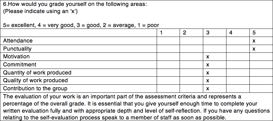
Using the sketchbook in studio brief 2 has allowed me to bring in more media play into my work, which is good as I have not really been experimental with other medias other than digital ones in the previous modules. However, I found filling out our sketchbooks at the beginning of the brief quite a struggle, as I am not used to just sketching without knowing what it is that I want to communicate first. I felt quite lost for this part of the brief - I am not sure if this is due to the subject that I decided to delve into or if I’ve just really lost momentum and not working as hard - but I think this has had a negative impact in my motivation and commitment to do other things later on in the process.
Things I would do differently if I were to do this again:
- For the second brief, to pick a less broad subject - so to not leave me with too many choices that would confuse me
- But if I were to do it on colour again, I think I would make the final outcome more informative, in a booklet format or a zine with a combination of text to add support and explanation of the subject as it is quite hard to explain with only pictures.
- Try and put as much effort into my work in this module as I have done for the others.